
The Story of Broke's visual uses black and white because it was meant for informing the the audience rather than entertain them.


It has a point of view from herself or her research or the "people"
The information type itself is set on a chronological order or we can say cause and effect, then solution.
The simplified visual makes this infographic easier to understand.


 It shows good labeling, like the hair represents the people's voice or choice or so we called Government.
as shown in the pictures, the government gives promises about better future, so that we vote for him.
and he is also the one that collect and decide how to spend the taxes that he collected.
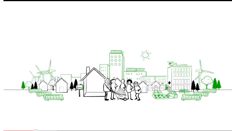
In the story of broke, It only shows black and white as the main color and green and black to differentiate the bad and good spending. The green color usually represents the environment friendly stuff.

This picture show how the money was spend for the government living, It uses a metaphor of them sitting on a money made couch which represents how luxurious their life are.


The Use of Metaphors are everywhere, to make the informations simplified and more entertaining. It also use the icon to symbolize what is happening. like a Tank sucking money machine which mean, the military is using the taxes for their purpose.
They also show an approximate number of taxes collected per year which is the use of actual data.


The guy in black hat and money sign resembles the big corporation or people that suck the money out of the taxes, or the bad guy. Also what the government have spend the money with. It only shows the bad side of the government... i guess.... which encourage us to spend more on the white hat guy, which is the environment friendly stuff.


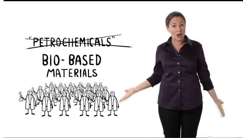


This girl, shows what's the "truth" behind all the "good" things done by the government for us. Like free stuff that suppose to be free and how a Bad government acts, she encourages us to think and tell us that we're not broke at all. Even this is like one-sided, I think she try to make people care more.... i think... rather than sit around doing stupid assignments lol.
The learning style falls under visual, auditory/verbal as there are drawings... and there is the person talking.
The communication method is in the form of motion, obviously.. the information is presented progressively in a linear sequence.
No comments:
Post a Comment